Project Details
During my time interning as a UX Designer & Researcher @Era Design
- Summer 2023.
Duration: 4 months of involvement.
Team Members
Vera Soper
Matt Berning
Jody Wells
Dan Tudor
My Roles
User Research
Ideation
Wireframe
Information Architecture
Site Map
Prototype
User Test
Tools Used
Figma
Mural
Adobe XD
01.
____________________________
PROJECT OVERVIEW
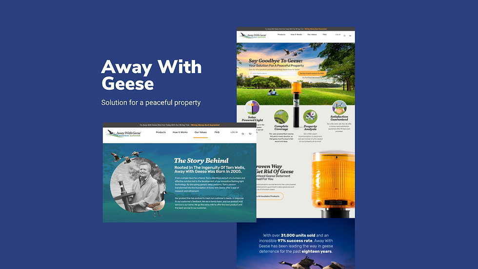
This project aimed to transform Away With Geese's website to drive higher product sales by enhancing product presentation, improving user experience, and optimizing conversions.
Additionally, we elevated AWG's brand recognition within the target market by creating a visually appealing design, reinforcing branding, and employing effective content marketing strategies. Through this redesign, we positioned AWG for increased sales and heightened brand visibility.
PROJECT OUTCOME

Source: awaywithgeese.com
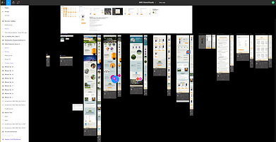
Successfully revitalized a 70+ screen website by conducting user interviews and implementing iterative cycles of benchmarking, wireframing, and prototyping. The project streamlined processes, improved user experiences, and optimized content, resulting in an enhanced digital platform.
PROBLEM
The AWG website faces challenges related to inconsistent design, an overload of textual content, and a notable absence of interactive elements, all of which hinder user experience and complicate effective messaging.
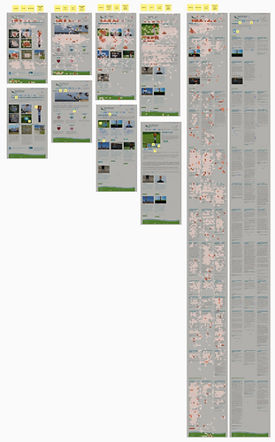
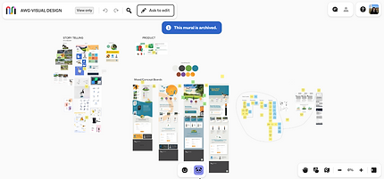
WEBSITE AUDITING - MURAL
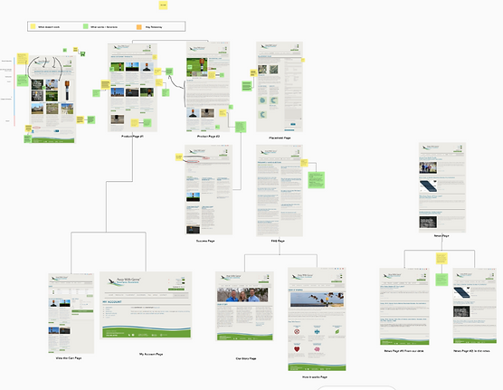
INITIAL TAKE-AWAYS
-
Ensure consistent navigation throughout the website.
-
Optimize the quantity selection feature for intuitive use.
-
Enhance the FAQ page by organizing questions, using clear language, adding visuals, and addressing real user concerns.
-
Include interactive elements, such as videos and interactive diagrams, to enhance the understanding of product information and placement guidelines.
-
Implement a prominent call-to-action (CTA) on the product pages, encouraging users to take the desired action, such as "Add to Cart".
-
Use interactive visuals and videos on the placement page to help users better understand the information and make informed decisions.
THE PROCESS
1. BENCHMARKING
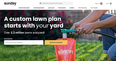
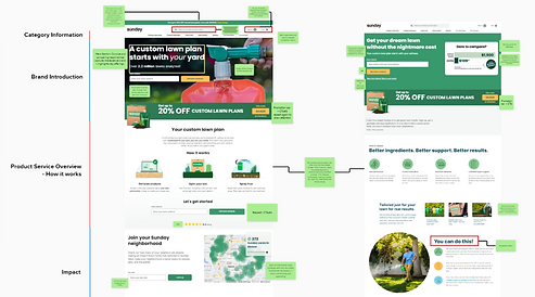
Why SUNDAY?
We selected Sunday as our benchmarking website due to its product similarities, such as property care, and a user flow that begins with property analysis and offers customized plans to customers. Additionally, the Sunday website adheres to industry standards by effectively conveying the brand's story and values.

What I learned
-
Craft concise and compelling headlines that effectively convey the brand's essence and highlight key offerings, capturing user attention.
-
Maintain a clearly labeled menu navigation bar, enabling users to easily find the information they need.
-
Place Call-to-Action (CTA) buttons strategically throughout the website to guide users toward specific actions, improving conversion rates.
-
Incorporate customer testimonials or reviews, including images and ratings, across relevant pages.
-
Highlight key selling points of the product within the context of comparisons with competitors, using clear and compelling messaging to showcase advantages.
-
Utilize friendly and approachable language to establish rapport with the audience, creating a sense of familiarity and trust, ultimately increasing user engagement.
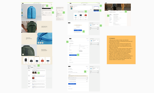
Why AWAY?
Away's website stands out as an excellent benchmarking reference. It features a well-organized product detail page with a clear and minimalist layout. Moreover, the seamless checkout process ensures a user-friendly experience that doesn't overwhelm customers.
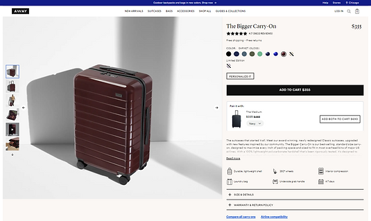
What I learned
-
Utilize clear progress indicators, like visual progress bars, to keep users informed about their current step and the remaining steps in the checkout process.
-
Present a concise summary of the order on the checkout page, including item details, quantities, prices, and any applicable discounts.
-
Offer a diverse range of secure payment options to accommodate different user preferences and increase convenience.
-
After completing the checkout, provide a well-structured order confirmation page with essential information, including the order number, estimated delivery date, and customer support contact details.
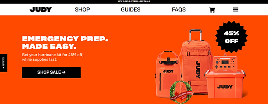
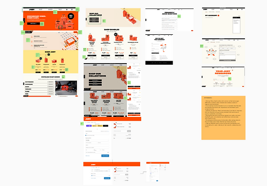
Why JUDY?
We selected Judy as a benchmarking website due to their exceptional customer support capabilities via the website, offering various forms to assist customers. Additionally, their website incorporates strategically placed, strong call-to-action buttons that enhance user engagement and interaction.
What I learned
-
Seamless customer service processes for returns and exchanges contribute to a positive overall user experience, ensuring a hassle-free shopping journey.
-
Providing essential product information prominently after adding items to the cart assists users in making informed purchase decisions.
-
Offering various buying options increases flexibility and convenience for users, catering to their specific preferences and needs.
As an entry-level UX designer, the process of benchmarking has been an invaluable learning experience. It has expanded my knowledge and understanding of diverse approaches to project design by incorporating various elements and strategies to optimize user experiences.
Through this journey, I have gained insights into how different companies use their websites to tell their unique stories and establish meaningful connections with their customers. Benchmarking has provided me with a holistic perspective on the UX design landscape, allowing me to grow and evolve in my role.
REFLECTION CORNER
2. USER RESEARCH
“Hottest” areas of
Away With Geese website
What draws customers to those areas on the website?
How can we encourage more engagement with the property analysis, a key factor contributing to sales conversion?
UX Research Study Plan
Framework provided by Google
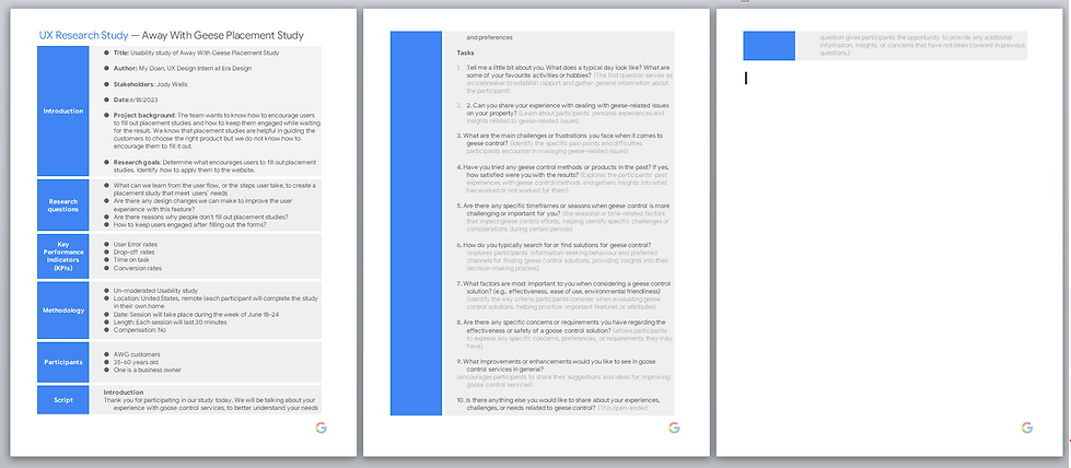
View my UX research study HERE
TAKE-AWAYS
- While users understood the concept of a property analysis, provide additional context and explanation on the website to ensure a comprehensive understanding of its purpose and benefits. Outline the process and highlight how personalized recommendations can enhance the effectiveness of the geese deterrence solution.
- Users raised questions about the commitment to purchase products after filling out the property analysis form. Address this concern by emphasizing the importance of the study in tailoring recommendations and assure users that it does not obligate them to make a purchase.
- Users mentioned that their neighbors showed interest in the product. Emphasize this positive aspect on the website to demonstrate that AWG's solutions not only effectively deter geese but also have a minimal impact on neighboring properties.
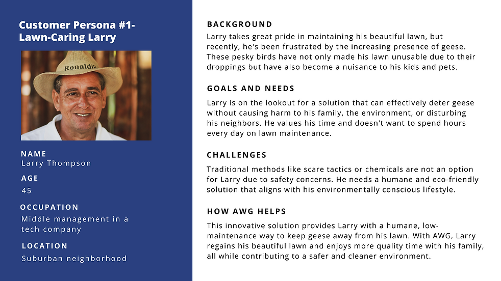
3. USER PERSONA
.png)
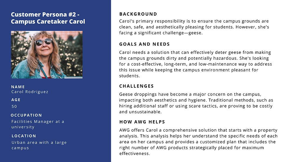.png)
4. SITEMAPPING
After gaining valuable insights into our users, understanding their unique needs and behaviors, we embark on a crucial phase of our UX journey – site mapping. This pivotal step involves translating our user-centric approach into a structured digital landscape.
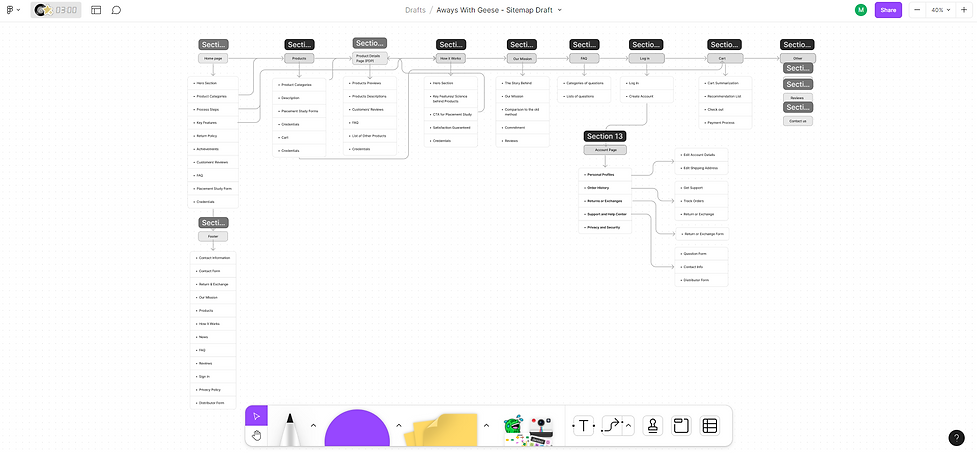
Tool: FigJam
Our aim is to streamline content and navigation, ensuring that users effortlessly access the information they seek. By creating an intuitive site map, we pave the way for a seamless user experience while aligning with our business goals, notably increasing engagement with our property analysis feature.
5. WIREFRAMES & LO-FI PROTOTYPE
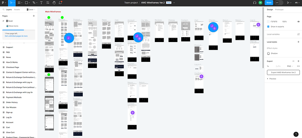
Tool: Figma
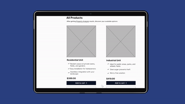
View my full prototype HERE
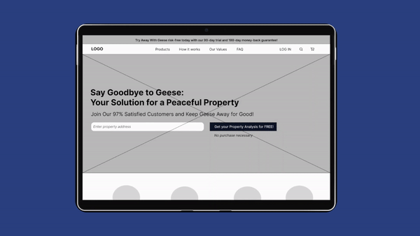
FINAL STAGES
In the subsequent phase of creating the high-fidelity prototype, collaboration became paramount. Working closely with fellow UI designers, stakeholders, and our talented developer, we employed tools such as Figma and Mural to foster seamless communication and expedite the design iteration process. The goal was to transform the user-centric insights and low-fidelity wireframes into a fully realized digital experience.
As part of our commitment to user-centric design, we actively incorporated feedback obtained from users during the testing phase. Their valuable insights played a pivotal role in enhancing webflow and navigation, ensuring that every interaction felt intuitive and rewarding.
Brand visual elements & hi-fi prototype developed by Matt Berning
Additionally, recognizing the significance of precise and compelling copy, I meticulously curated an 80+ page copy tracking document. This document served as a guiding compass, ensuring that every piece of UX copy harmonized seamlessly with the features and functionalities on the website.
Our collaborative efforts bore fruit, culminating in the creation of a high-fidelity prototype that not only met but exceeded our design expectations. This dynamic prototype is now poised for the final transformation into a fully functional website, ready to be coded and launched to provide an exceptional user experience and bring Away With Geese's mission to life.
REFLECTION
Lessons learned from the AWG Website Redesign Project:
1. Balancing Business Goals and User Needs
Throughout the AWG website redesign project, I gained a profound understanding that business goals and user needs don't have to be in conflict. Drawing from my background in business, I was uniquely positioned to strike a harmonious balance between these two crucial aspects. It was an enlightening experience, navigating the intricate interplay of optimizing for the business while ensuring a seamless user experience. This dual perspective allowed me to create design solutions that not only met the company's objectives but also genuinely resonated with the users.
2. The Power of Attention to Detail
One of the most impactful takeaways from this project was the significance of attention to detail, particularly in user interviews. Despite my limited prior experience in conducting user interviews, I was intrigued by the process of delicately extracting insights while maintaining objectivity. It was essential to listen actively, avoiding undue influence, and staying aligned with the project's overarching goals.
3. Bridging the Gap with Creative Storytelling
The AWG project, centered around geese deterrence, presented a unique challenge. I discovered that even when faced with unfamiliar products or industries, creative and empathetic storytelling can bridge the gap between user needs and digital experience. This task encouraged me to step into the users' shoes, understand their needs, and craft a compelling narrative that guides them toward the ideal solution.
As I look ahead, I'm excited to take on more captivating projects that offer opportunities for continuous learning and growth. These lessons from the AWG project have equipped me with invaluable insights and skills, further fueling my passion for crafting exceptional user experiences that align seamlessly with business objectives.
For work inquiries or just to chat, feel free to reach out at mydoanha278@gmail.com
Thanks for reading!✨


.png)