.png)
Timeline
12 weeks
Tools used
Figma
Project overview
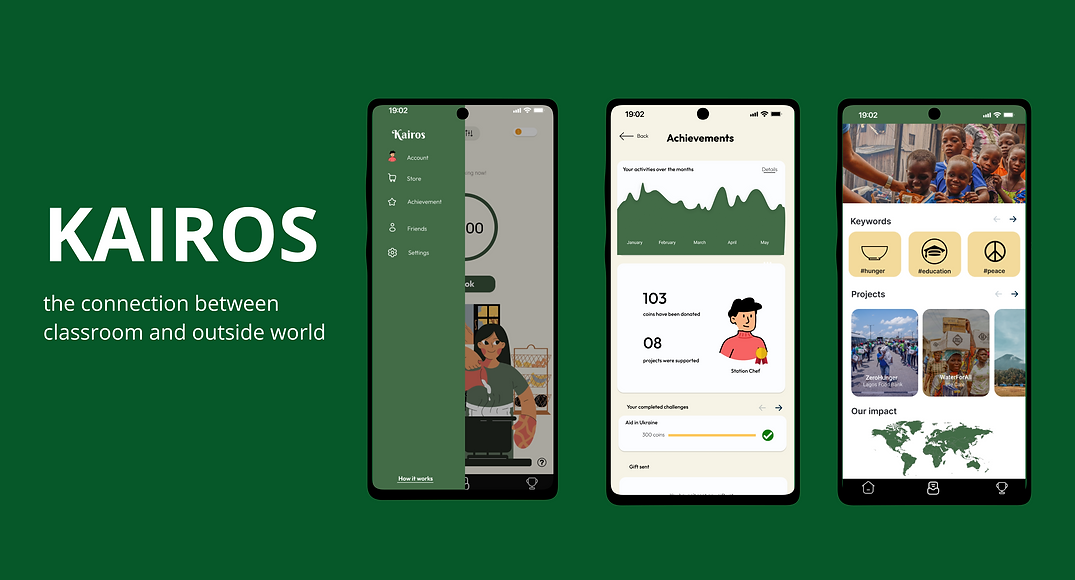
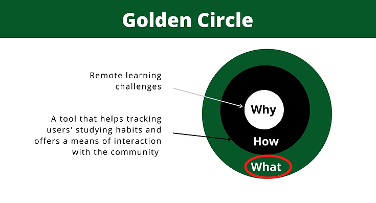
With the use of Pomodoro method (25-minute focus cycle), Kairos was created in the effort of solving remote learning challenges by converting focus time into donation for charities. This mobile application acts as a digital time management tool, a source of motivation and a mean to connect to the community for students.
My Roles
User Research
Ideation
Wireframe
Prototype
UI design
User Test
Project outcome
Usability test for Kairos was conducted based on the performance of both its low and high fidelity prototypes with 95% satisfaction from 30+ users. Responses were recorded with feedbacks for the future development.
PROBLEM
As a college student, I’ve noticed many of my peers struggling with online learning during the COVID-19 pandemic.
Remote learning has a lot of benefits, including flexibility, mobility, and affordability. However, without the supportive environment and in-person interaction, there are a lot of challenges including:
Lack of Productivity
Lack of Motivation
Lack of Communication
How could we potentially improve the quality of online education?
RESEARCH & BRAINSTORM
"Students who have more hours of volunteer activities and higher amounts of charitable donations tended to report higher levels of psychological well-being than their counterparts."
Geng Y, Chen Y, Huang C, Tan Y, Zhang C, Zhu S. Volunteering, Charitable Donation, and Psychological Well-Being of College Students in China. Front Psychol. 2022 Jan 7;12:790528. doi: 10.3389/fpsyg.2021.790528. PMID: 35069377; PMCID: PMC8777250.
There is positive relationship between charitable donations with students’ psychological well-being
%20(1).png)
SOLUTION
KAIROS - A MOBILE APPLICATION
With the use of Pomodoro method (25-minute focus cycle), Kairos was created in the effort of solving remote learning challenges by converting focus time into donation for charities. Besides, Kairos allows students connect to their peers and work together by creating challenges.
This mobile application acts as a digital time management tool, a source of motivation, and a mean to connect to the community for students.
Users are allowed to customize the app's theme so as to make the experience more enjoyable. The current theme that is used to illustrate throughout this project is "Cooking Theme"
%20(5).png)
%20(4).png)
%20(6).png)
THE PROCESS
COMPETITIVE ANALYSIS
%20(7).png)
What would be the market advantages for Kairos?
1. The ability to offer a supportive and motivational environment for users
Having the feature of opening a challenge by setting goals and inviting other members to join in
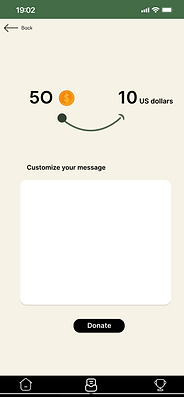
2. Enable users to track their donation after it was processed
Charities will be responsible to update the donating process and where the funds go so that users can see what impact they have made in the fight against social issues.
Besides, Kairos would potentially be an effective tool for organizations to embrace a younger and more passionate donor demographic that they are not currently reaching through other traditional fundraising methods, which is gen Z. It would both help them to raise awareness about their works and diversify revenue streams.
USER PERSONA
%20(9).png)
WIREFRAME
Paper Wireframes
The wireframes/low-fidelity prototypes of the primary screens/interface are paper-based and do not allow user interactions. This is helpful in enabling early visualization of alternative design solutions


USER FLOW
The next step is defining the key path taken by a prototypical user on the app to complete a task. This is a great way to put myself in the user’s shoes and ensure that the product prioritizes their needs.

DIGITAL PROTOTYPE
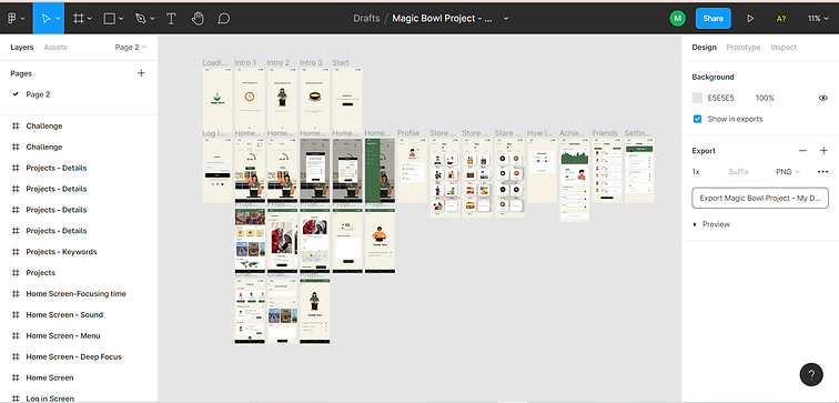
I used Figma for my first digital prototype. Having a digital prototype developed based on the paper wireframes allowed me to test the potential main features and see how the design will look in the future. Besides, I could iterate quickly and effectively. Iterations of the prototype was rolled out multiple times based on user testing and feedbacks.
.png)
Note: The name of the app was changed from “Magic Bowl” to “Kairos”. The reason behind this change is that since the theme of the app may be switched from cooking to other activities, “Kairos” would be a more flexible name regardless of the app’s theme.
USABILITY TEST
METHOD 1: THINKING ALOUD TEST
A think-aloud test with 3 key users was conducted after finishing the first prototype. By using this method, users’ behaviors could be observed closely, which provides valuable insights into human’s natural reactions toward the new product.
Open-ended questions were asked to evaluate users' experiences:
-
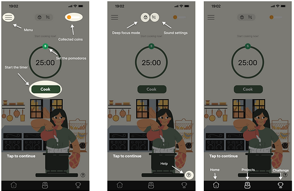
What do you think about the launching screens with short introductions?
-
What are some of your initial expectations about these apps after reading them?
-
How do you feel about setting the focus time?
-
How easy it is to switch between different focus modes?
-
How do you feel about the reward system (coins, exp. points, etc.)?
-
Is there anything else you wish you could purchase in the store for customization besides the characters, background, and sounds?
-
How easy it is to find the projects you want to support?
-
How easy it is to create a challenge?
-
How do you feel about inviting your friends to join the challenge?
-
What do you think about this design? Is it appealing to you?
-
How would you describe your overall experience with this product?
-
What features do you find most valuable and why?
-
If you could change one thing in this product, what would it be and why?
-
Are there any other features that you wish the app could offer?
METHOD 2: SURVEY
A survey of 32 questions was sent out after having the second version of the prototype. By using the UTAUT model, the overall usability of Kairos was evaluated in terms of performance and effort expectancy, social influence, facilitating conditions, hedonic motivation and habit.
RESULTS AND DISCUSSION
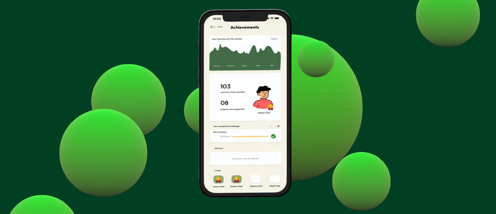
Profile: Students / 16-22 years old / average focus time a day is 5.6 / somewhat got involved in doing charity works in the past / 90.4% believe that technology could be used for social works.


The result showed a good sign that Kairos is on the right way to achieve its goal of being a digital time-management tool that would increase both of users’ productivity and motivation to work. By allowing users to choose the projects for donation, they become more aware to the social problems and feel more motivated to use the app.
%20(10)_edited.jpg)
However, to make using it as daily habit, Kairos should offer more attractive features such as having an appealing rewarding system and help users to keep track of their focus time more effectively.
IMPROVEMENTS
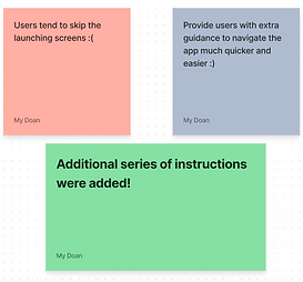
Overall, I got positive feedback from the usability tests, including the good choice of colors for the user interfaces, how easy it is to navigate, and the feasibility of the app. Based on the conversations that I have with the participants, the survey results and my own reflection after creating the prototype, there are some improvements that I need to make:
-
Improve the consistency in designs by using the round edge style for all the buttons.
-
Users tend to skip the launching screens, therefore, there is a need of offering more assistance in terms of how the reward/coins system work
-
Figure out a stable way to generate donations from the app (consider using the processing power)
-
Offer more means of interactions between users (maybe newsfeed or message feature)
-
Make some of the features/icons more visible by adding texts/instructions next to them
Other than that, I also need to start prototyping the rest of the product's functions including how to request sponsors, invite friends, etc.
SOME MAJOR IMPROVEMENTS


.png)

FINAL PRODUCTS
A higher fidelity prototype was finalized with new improvements
REFLECTION
%20(11).png)
TAP THE SCREEN TO START VIEWING THE PROTOTYPE
View my full report HERE
REFLECTION
As my very first UX project, there are some key UX principles that I have learned a lot though-out the trial and error process:
1. Know where I am in the design process
Since there are a lot of works goes into designing, the process was overwhelming at first for an entry-level UX designer like me. Thus, knowing my place in the process is significant in several ways. I need to keep reminding myself that reviewing a design asks for different conversations in different parts of the process so as to avoid unnecessary steps and have the right mindset.
2. Avoid sunk cost fallacy and escalation of commitment
As a natural part of human psychology, the more time we invested in an idea, the less likely are are willing to change. I always try to be willing to use alternative tools with low commitment at the first phases of my design process.
3. Understand accessibility
Accessibility is among what I value the most in designs. This comes with a line from the book called "The Design of Everyday Things" by Don Norman that I love: It is the duty of machines and those who design them to understand people. A designer’s responsibility is to make sure their design is usable for as many people as possible, including people with disabilities. My plan for Kairos would be tor remove obstacles from the UI design layout for problem-free navigation and develop some assisting features.

View my slide deck for KCV final presentation HERE
The idea was submitted to Kentucky Commercialization Ventures as a part of my 6-week of fellowship and successfully got a funding of $1,000 🎉🎉🎉
For work inquiries or just to chat, feel free to reach out at mydoanha278@gmail.com
Thanks for reading!✨

.png)
.png)