%20(12).png)
Timeline
4 weeks
Team
Brett Thaman
Anh Tran
Na Le
My Roles
Brief
Redesign the Home Page to better convey the message, including the purpose, mission and vision of PodScholars
UX Research
Ideation
Wireframe
Prototype
INTRODUCTION
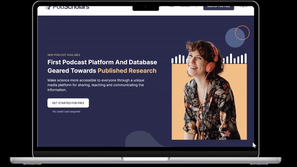
PodScholars is the first podcasting platform and database specifically geared towards published research, where scholars, researchers, and other experts can broadcast published science as audio or video casts.
Our mission is to make science more accessible to everyone through a unique media platform for sharing, teaching and communicating the information.
PROBLEM
1. There is a need to leverage the website features users value most to hold audiences’ attention without sacrificing functionality
2. Lack of branding elements
3. Unclear calls to actions (CTA)
What are the best practices for a both functional and visually-appealing PodScholars Home Page design?
GOALS
1. Helps website visitors form a positive impression of PodScholars
2. Increase conversions, user retention and create repeat users
3. Simplify user flows and make key functions more accessible
THE PROCESS
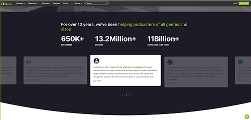
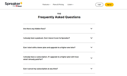
COMPETITIVE ANALYSIS
Below are some takeaways based on competitors' home page
1. Using modular blocks to present pieces of information on the homepage can best utilize the space
2. Clear and repeated CTA buttons in different locations to get users' attention
3. Provide social proof such as testimonials, etc.
4. Provide interactive content like videos and animated images
5. Have the FAQ section on the bottom of the page to better assist users


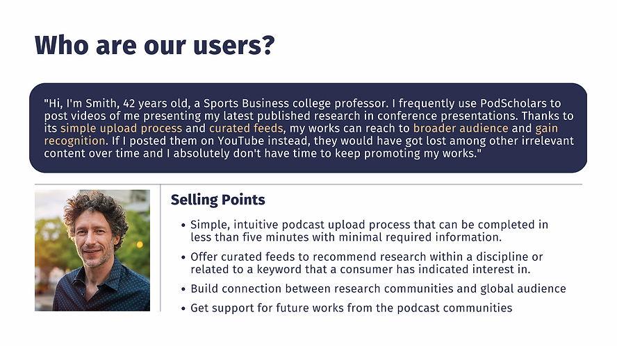
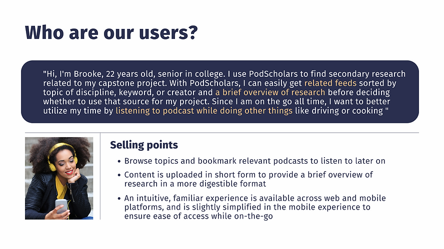
USER PERSONA
.png)
WIREFRAME
Paper Wireframes
The wireframes/low-fidelity prototypes of the primary screens/interface are paper-based and do not allow user interactions. This is helpful in enabling early visualization of alternative design solutions

Digital Wireframes
2D visualizations of how the page will look like when it's finished. They are the draft of the user interface, with grayscale shapes and minimal design elements.

.png)
.png)
.png)
PROTOTYPE
I used Figma for the prototype. Having a digital prototype developed based on the paper wireframes allowed me to test the potential main features and see how the design will look in the future. Besides, I could iterate quickly and effectively.

SCROLL DOWN THE SCREEN TO VIEW PROTOTYPE
THE STYLE GUIDE
.png)
.png)
NEXT STEPS
1. Conduct a usability test by sending out a survey
2. Collaborate with developers to create the page
3. Improve responsiveness on mobile and tablet
4. Iteration is the key
REFLECTION
There are some key lessons that I have learned after working on this project:
1. Break content up with section headers
When dealing with content-heavy part, it is important to break it up with headers. This would help audience scanning the information quickly and effectively by providing clear structure.
2. Provide social proof
By providing key insights to the product/service, success stories are a great way to inspire a positive first impression. This is important to keep in mind when working on leveraging digital experience of the product/service.
3. Make website mobile-friendly
Since most of my experience come from working with mobile app, it is important for me to learn how to make website mobile-friendly. It is highly recommended to have modular content so that the website could be responsive and translate well on mobile devices.
For work inquiries or just to chat, feel free to reach out at mydoanha278@gmail.com
Thanks for reading!✨
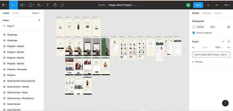
DIGITAL PROTOTYPE
I used Figma for my first digital prototype. Having a digital prototype developed based on the paper wireframes allowed me to test the potential main features and see how the design will look in the future. Besides, I could iterate quickly and effectively. Iterations of the prototype was rolled out multiple times based on user testing and feedbacks.
.png)
Note: The name of the app was changed from “Magic Bowl” to “Kairos”. The reason behind this change is that since the theme of the app may be switched from cooking to other activities, “Kairos” would be a more flexible name regardless of the app’s theme.


.png)